4. The Power of Colors
"Color is a power which directly influences the soul". Wassily Kandinsky
Buongiorno a tutti :) ! Our weekly appointment has arrived again. I hope you had a nice and creative week!
I have to admit that in the beginning of this week I felt tired, a bit down and somewhere else with my mind…so creativity was not fully there.
Weeks like this happen to everyone, I guess.
However, do you know what somehow helped me to give a twist to my mood? Color!!! Yes, color has a biiig power on our mood and emotions (as the quote of Mr Kandinsky upthere says…), so I decided that today’s blog will be dedicated to The Power of Colors.
What do you think?
Before explaining anything, what do you feel when you look at these photos below? Do you see something they have in common?
“Mmm…maybe warm colors”? Yeah, I think so too. And you know one more thing? I realized that I chose to wear clothes with these same “warm” colors during the entire week! Did I maybe need those colors?
Ok, now I gave you a hint ;)


Fujifilm X-T5 + Fujifilm XF 23 mm f/1.4 LM WR or XF 90 mm f/2 LM WR
Colors are a big part of our lives and even when we don’t fully realize it, we use them to influence our mood, deliver emotions and talk about feelings without need of words. I mean, how many times in the morning we pick our clothes because, unconsciously, we feel the need of that color? “It’s so cold and dark outside, let’s pick a warm red pullover”… Right? And then we go to a café’ decorated with plants and wooden tables and we feel mind clarity, like when we are immersed in nature and connect with its powerful, fresh vibes… and in the evening we like being surrounded by some blue, because it gives us the deep calmness of the night, of the sea, of the silence…
Artists, interior designers and graphic designers have long known the power of colors and use it as a signature character for their art, to represent brands and to give a specific vibe to places. And for us photographers… well, colors are a super important tool to elevate the storytelling in our photos. How? Well, for example, enhancing the presence of a certain color we can deliver and emphasize specific emotions. This is part of the “science” called Color Psychology.
If we go one step forward (without getting too technical): have you realized that if you look at a photo full of red-blue-green you feel a completely different emotion than if you look at one in which red is paired with oranges and yellow?
Color Harmony is the relationship between colors and tells how they work together to create a specific aesthetic and mood. There is a really nice tool called Adobe Color (https://color.adobe.com/create/color-wheel) where you can play with the different color harmonies and have a better feeling of how to play with colors. The most common harmonies are:
ANALOGOUS HARMONY: colors that are next to each other on the color wheel, such as yellow, yellow-orange, and orange. These combinations evoke a sense of calm and tranquility, as seen in many natural scenes, such as sunsets.
MONOCHROMATIC HARMONY: there is a single key color with different ranges of brightness. It is also very common in nature. This creates a unified and harmonious look, allowing to emphasize one dominant color in the composition.
COMPLEMENTARY HARMONY: there is a key color paired with the opposite on the color wheel, like blue-orange or red-green. This color harmony is used to create contrast in the image and is very used by film makers and photographers when they want to direct the attention to one subject, capture the attention and add visual interest.
SPLIT COMPLEMENTARY HARMONY: there is a key (base) color paired with the two colors that are adjacent to its direct complementary one. This harmony provides high contrast like the complementary, but with less tension.
In this example I took ORANGE as key color, but you can use any other color as starting point to create the harmonies.
Source: Adobe Color.
There are more color harmonies for you to explore on Adobe Color, but I did not want this blog to become too heavy and technical.
I just add one more thing that could be useful to all photographers. If you are new to the concept of color harmony, you will probably wonder how to apply it in your everyday photography. Here some suggestions:
Subject Matter: look for scenes that naturally present harmonious color combinations, suitable to help you deliver the feeling you want to communicate in your photo.
Styling: if you have a portait session, choose wardrobe and background with a color harmony that create a specific mood or emphasize your subject.
Lighting: pay attention to natural or artificial light and shift the color balance in the scene to create a harmonious effect.
Street photography: choose your scene wisely and wait for the subject that wears the colors that harmonize in a way that helps you delivery your story in a powerful way.
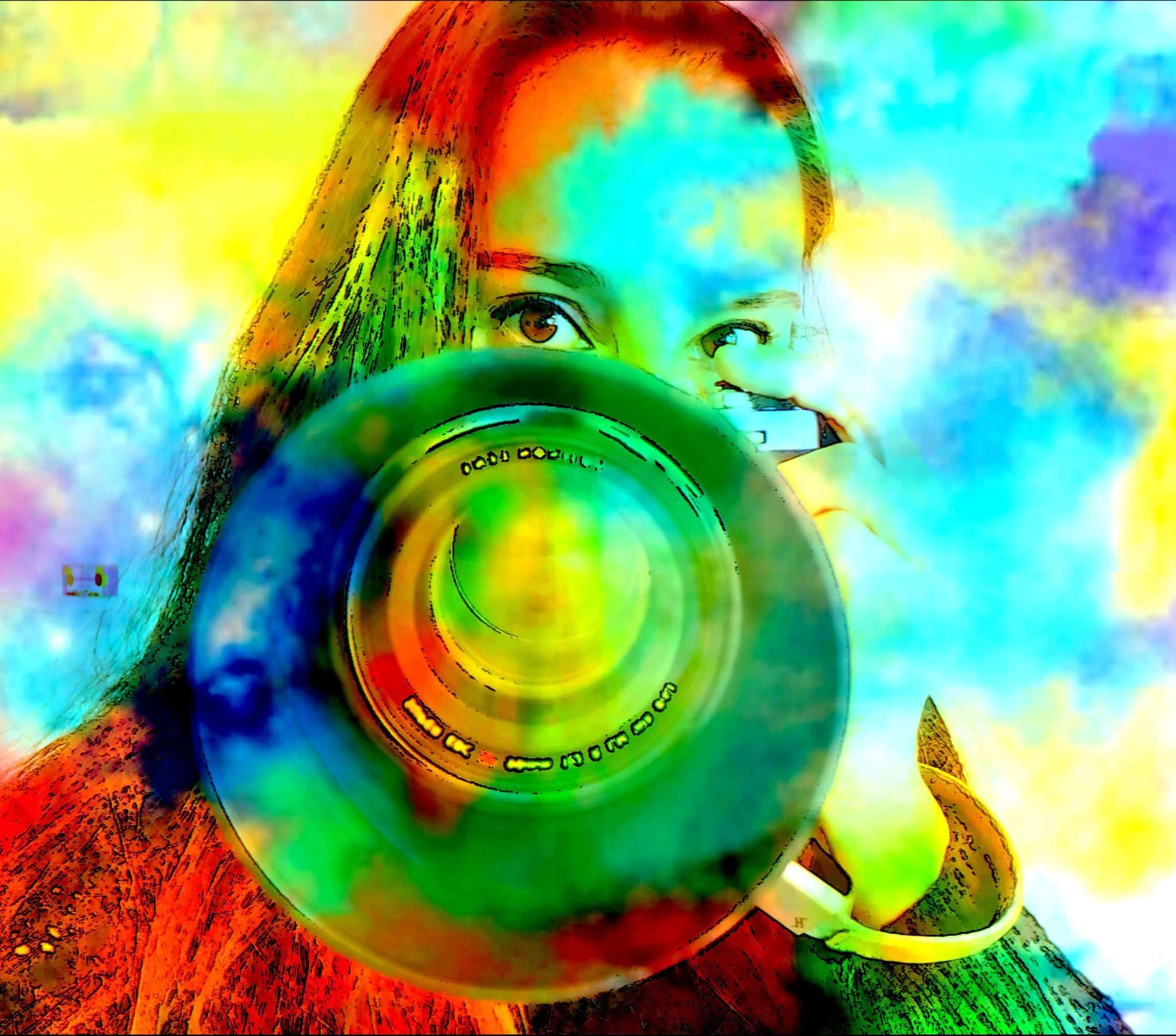
Post-processing: adjust hues, saturation and luminosity using the tools offered by all editing softwares. Do not over-edit, unless you specifically want to create a “shocking effect” (see my photos below), and aim at creating the desired color harmony with subtle shift of colors.
Ok, I don’t want this coffee break to become a Graphic Design lecture, also because color theory would need soooo much more than the time of a coffee break… I just tell you that I am taking a master class in Graphic Design and I still have plenty of hours to study in order to understand everything.
So, I leave you with a double exposure that I took yesterday afternoon: the color harmony of the original version is based on analogous colors, while the second one is edited pairing complementary colors (a bit “Pop Art” style). Can you FEEL a different emotion?


Fujifilm X-T5 + Fujifilm XF 90 mm f/2 LM WR
I hope that you enjoyed this colorful coffee break snap!
Please leave me a comment and let me know if you feel these little tips will help you to better express moods and feelings in your photography (… talking about colors: it would be so cool if you could post your flag in the comments, so I know where you are based!!! :) ).
Chat soon again!
Best
Very